work: brand + story strategy
City of Raleigh rebrand
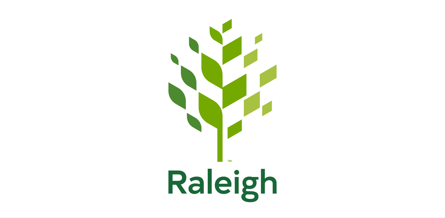
New logo designed, by The Assembly, for the City of Raleigh
As part of the City of Raleigh’s strategic plan process they discovered the need to develop and implement a comprehensive communications policy and plan to effectively tell the City of Raleigh’s story. The rebrand was one important part of this initiative and their priorities included:
Improve residents’ experience while also gaining internal efficiencies by minimizing departmental communication fragmentation
The City’s departments used different images and versions of the city seal to brand their communications, as a result, the City of Raleigh’s brand is not easily identifiable nor are citizens’ interactions with the City consistent.Maintain the officialness of the City’s seal by no longer using it interchangeably as both a seal and a logo
The City’s seal was designed to be used on official documents. The new logo, on the other hand, serves as an official brand mark that is more appropriate for day-to-day communication and interaction with residents.
The City of Raleigh hired The Assembly to lead design strategy and development of the city’s first logo as well as build their brand guidelines. Diverse input was important so we held three discovery workshops (73 participants across City employees, City Council, and community members) and published a public-facing survey (1,347 participants).
The logo and design system the City of Raleigh selected pays homage to the dualities that define it. A city of history and a city of innovation. The City of Oaks in a city with just as many pines, dogwoods, and crepe myrtles. A city where residents equally and emphatically value both the natural and the man-made. As the city evolves, the City employees saw their role not only to serve and connect but to ensure that progress is balanced — and for all.
Created in collaboration, as strategist, writer, and facilitator, with Gino Reyes and Joshua Gajownik: creative direction and design lead, Sarah and Daniel Faucette: design, and Cubic, Inc.: brand positioning.
Process:
UNDERSTAND > DEFINE > research > IDEATE > prototype > Build > REfine
The Assembly brand strategy
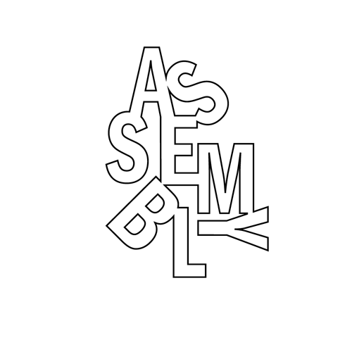
Logo design by Joshua Gajownik
The Assembly is the brainchild of Gino Reyes, Nikelle Orellana-Reyes, Joshua Gajownik, Nick Neptune, and myself. Beyond creating an energizing studio space we ourselves wanted to be in, we wanted to ensure our brand was differentiated from the many other co-working-like spaces in Raleigh. So, like we had done for so many clients, we held a workshop and formally defined the brand that lived in our heads.
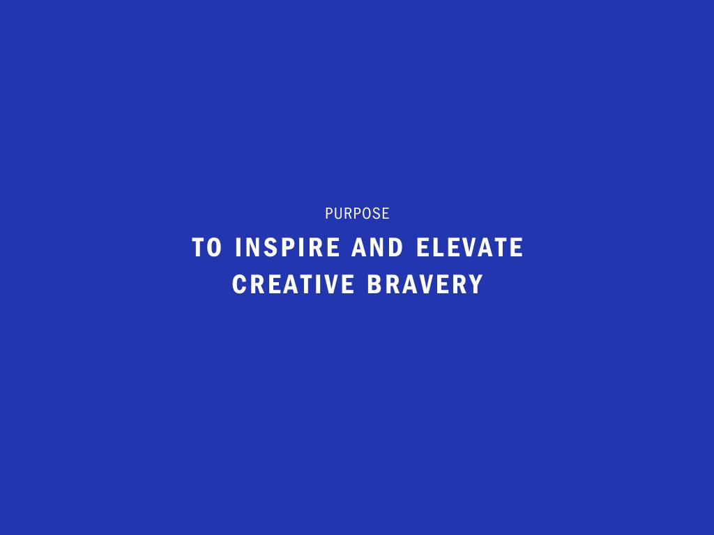
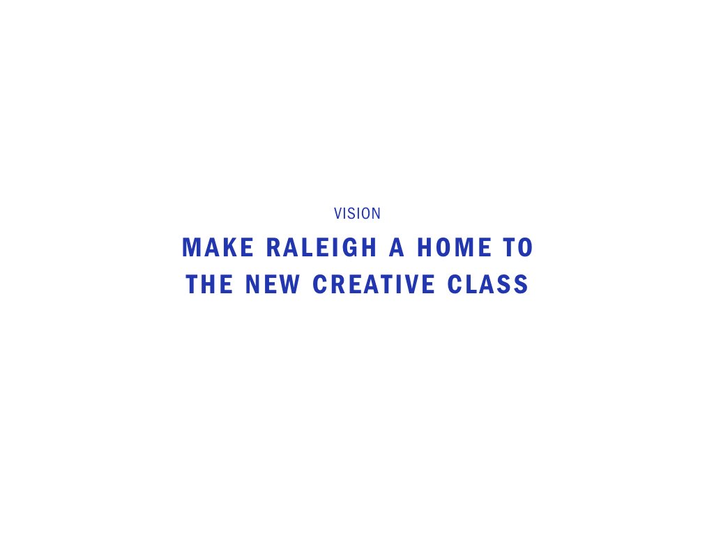
We believe Raleigh is a home for the New Creative Class — talented individuals with creative ingenuity, a maker mentality, who prefer professional independence to ensure their time is spent on work that matters. But, going at it “alone” is hard and isolating. Enters The Assembly — a collective and shared platform, aiming to inspire and elevate creative bravery.
By building upon the contributions made by those that have come before us, we created a home base that elevates individuals, supports creative ingenuity, and leads with purpose. The result: camaraderie and the infrastructure to take your creative endeavors to the next level.
The Assembly brand was created in collaboration, as brand strategist and copywriter, with: Gino Reyes, naming and creative direction; Joshua Gajownik, logo design and creative direction; Nikelle Orellana-Reyes, web design and creative direction; Nick Neptune, community organizer.
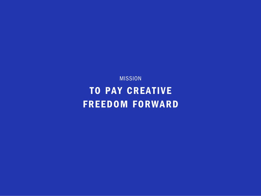
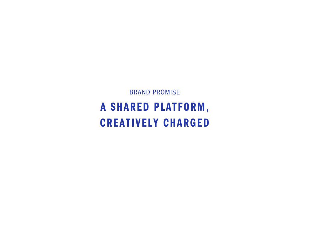
Advanced Learning Partnerships’ brand strategy
After 10 years in business, Advanced Learning Partnerships (ALP), a consultancy that sits at the intersection of education, innovation, and leadership, had the case studies to prove their approach paid dividends for the 650 communities across North America they had partnered with, but as the team grew, they had come to realize they needed a succinct way of telling their story. I partnered with the ALP’s leadership team to define their brand strategy. After conducting interviews, a survey, and a positioning workshop, I crafted their purpose, vision, mission, brand promise, brand positioning statement, brand declaration, and core brand story.
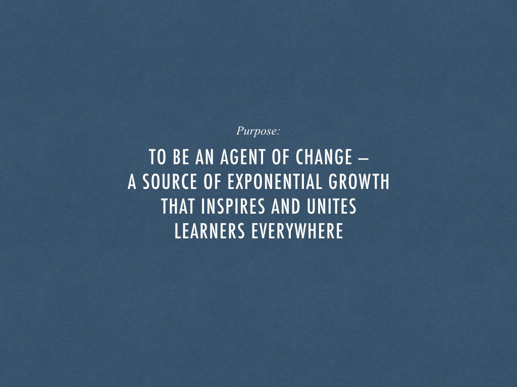
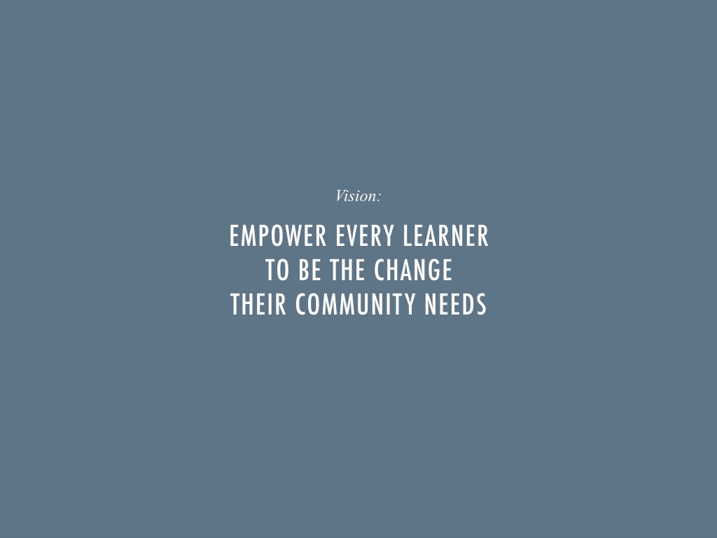
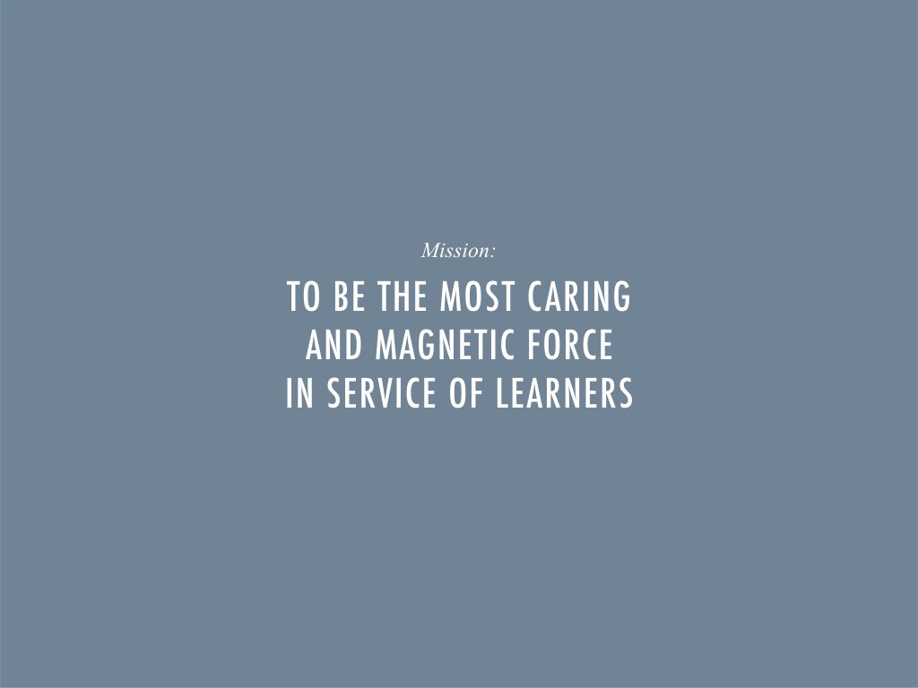
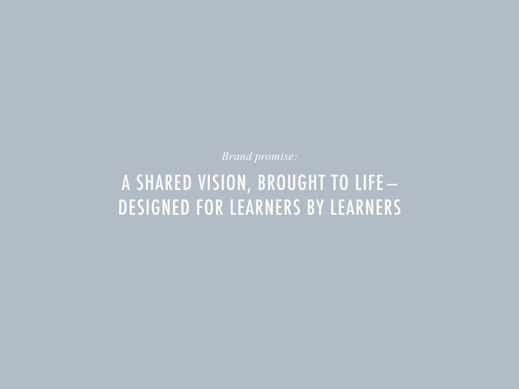
The ALP brand strategy was created by me, as brand strategist and copywriter, in collaboration with the ALP leadership team and used as the foundation for their brand redesign led by Eric Cox of Bright & Early Design Co.
Vision & keynotes
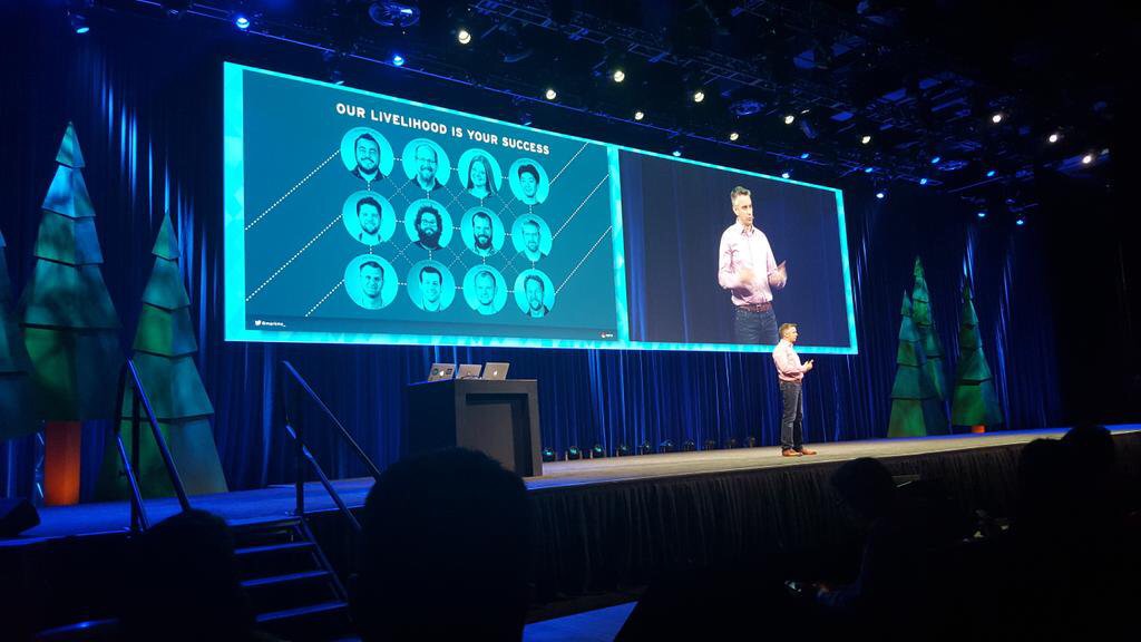
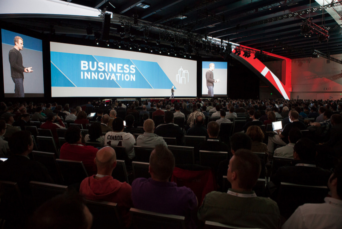
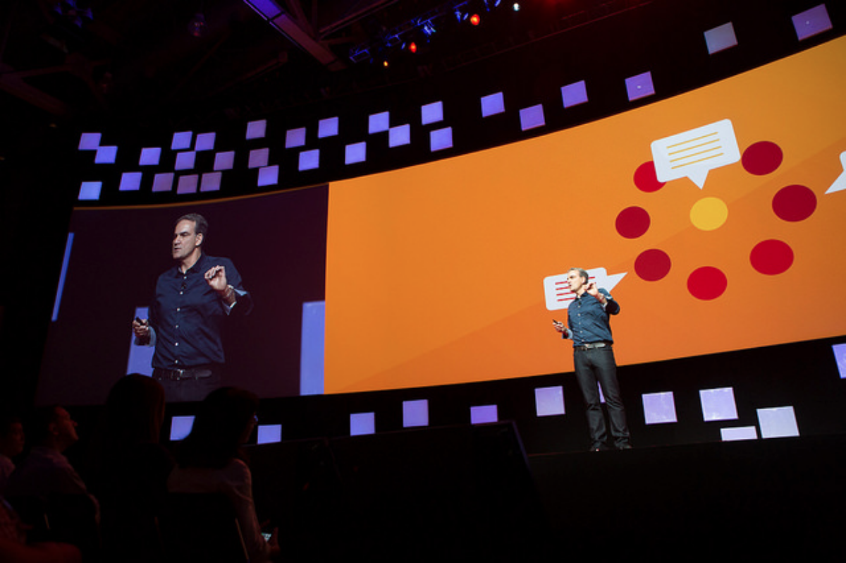
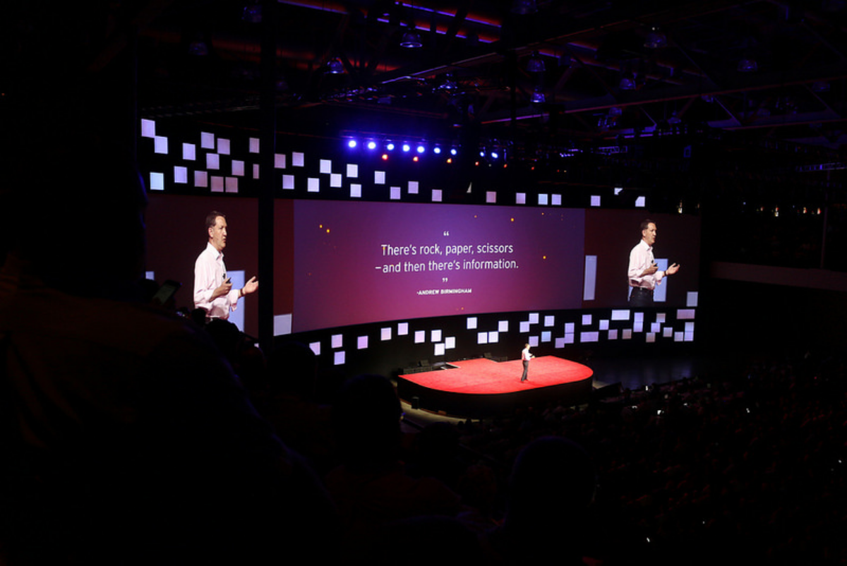
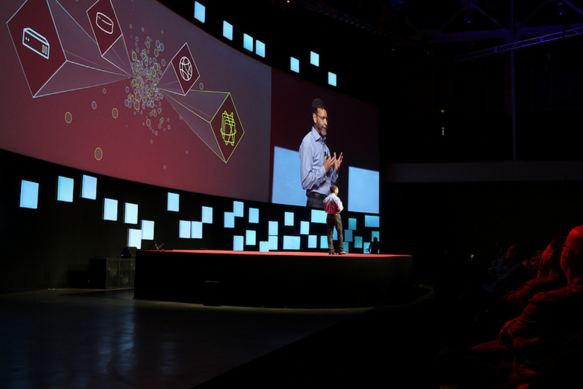
Never underestimate the power of a person sharing a vision and telling a story on a topic they are passionate about. I've had the privilege to collaborate with some of Red Hat's most senior executives to craft impactful stories for the main stage at events around the globe.
Each keynote was created in collaboration, as story lead, with the speaker, various subject matter experts, and Red Hat's in-house creative team.
Process:
understand > DEFINE > RESEARCH > ideate > OUTLINE > STORYBOARD > BUILD > REHEARSE > REFINE
Video
The OpenStack Summit is a bi-annual event where the community behind OpenStack comes together. As a lead sponsor at the Fall 2014 OpenStack Summit in Paris, Red Hat wanted to acknowledge not only the power of participation but the community at large — after all, technology is only as strong as the people that stand behind it. This premiered on the main stage.
Created in collaboration, as strategy and script lead, with: Mark McLoughlin; Engineer and subject matter expert; Laura Walters, Animation lead; Matt Morain, Editor; Megan Kennedy, Voice-over;